

Hello. This is Nakamura, the owner.
Today I would like to talk about the mid-century pop art aspect of Scandinavian tableware.
The appeal of Scandinavian tableware is that although it has a simple design, it is not childish, and you can find a sense of design in it.
A typical design is a pattern called Berså by Gustavsberg.

Photo: Bersa pattern representing Swedish mid-century
It was invented by Stig Lindberg, one of the most prominent Scandinavian industrial designers.
Bersa means arbor, and the design evokes images of a garden with sunlight filtering through the trees in the afternoon, and a beautiful sunny day with bright, lush greenery.
However, Bertha's design is simply a series of green leaves.
It's a fairly simple design that even a child could draw.
If you are aware of a design similar to this one,
Andy Warhol's Campbell Soup can.

Photo: Warhol's " Campbell's Soup Cans " created in 1962
Another example of Warhol's work is the laundry detergent sculpture Brillo Box, which is a series of boxes with the same design.
Marilyn Monroe is most famous for Warhol's work.
All of these have one thing in common: ``Even though the same thing is continuous, it is established as a design.''
Stig Lindberg designed Bertha in 1961, and Warhol designed his first pop art piece, Campbell's Soup, in 1962.
In other words, both were art movements that occurred at the same time.
By the way, Andy Warhol created multiple copies of the same work using silkscreen prints.
In other words, there are multiple pieces of the same image, and the concept that ``only one is a true work'', which existed in previous paintings, does not exist.
It is called "Pop Art" because it is all authentic, created by the artist himself, there are multiple authentic pieces, and it has been accepted by the public.
There are many things that are the same, and all of them are real.
On the other hand, Stig Lindberg's works are also characterized by the use of transcription.
Up until then, the Gustavsberg workshop had valued hand-painted paintings, such as faience.
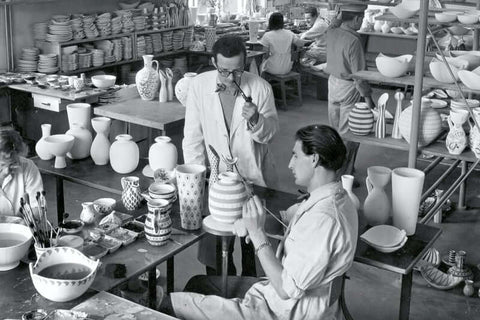
Photo: Lindberg giving instructions on painting at Gustavsberg's workshop.
Even now, G-Studion's works tend to be traded at relatively high prices on the market.
Lindberg, who was trained by his master Wilhelm Koge, also teaches younger painters at G Studio, where young painters demonstrate their skills.
However, it was the middle of the 20th century, and traditional hand-coloring alone had drawbacks, such as not being able to increase the number of products produced and the quality of the products being uneven.
The way to overcome this is through mass production.
What can we do to ensure that our products do not lose their appeal even when mass produced?
To achieve this, the design must be excellent,
As mentioned above, it is important that "everything is the same and authentic."
And while Warhol used silkscreen prints, Gustavsberg's studio used a method called transfer.
Simply put, it means pasting a sticker.

Photo: Painting by transfer
In this way, the creations of the golden age known as mid-century actually have something in common with pop art in that while they were able to be mass-produced, they were all lined up with the same faces, and all of them were authentic.
Gustavsberg's Bertha is now being reprinted, using a transfer process that is faithful to the original.
This is a very subtle difference in spooning, but
The vintage version of Bertha has better color than the reprint version.
It is an old product that takes on a lush green color when exposed to light.
Even though the same thing was created through mass production or transfer, it retains an excellent sense of color.
These can be clearly seen by comparing the two.


Photos: Vintage (top) and reprint version of Bertha (bottom)
Of course, reprints have their own merits.
For example, a piece of ware called bone china is
Whiteness stands out more beautifully now than in the past.
This is because the materials are stably supplied and the firing technology can be controlled mechanically.
In that respect, the current version is superior to the vintage version in terms of the beauty of the white porcelain.
Also, the reprint version is thinner, so it feels lighter when you pick it up.
I hope you will take this opportunity to compare both.
Vintage has rich colors,
The reprint version has the beauty and lightness of the white background,
You can feel the passion of the craftsmen who are trying to revive the works of the Golden Age.
There are still some areas where it's not as good as it could be, but that's because the mid-century period was just too amazing.
See you soon.
Owner Nakamura